Introduction#
There was a question that came up on StackOverflow about how to create a three way toggle switch that looked like something on an Apple AirPods menu:
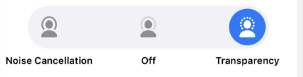
The question was deemed to complex for StackOverflow and was closed, but I thought the principle was something that should be explored in any case. I took a swing at building something, and this is what I came up with:
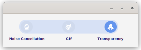
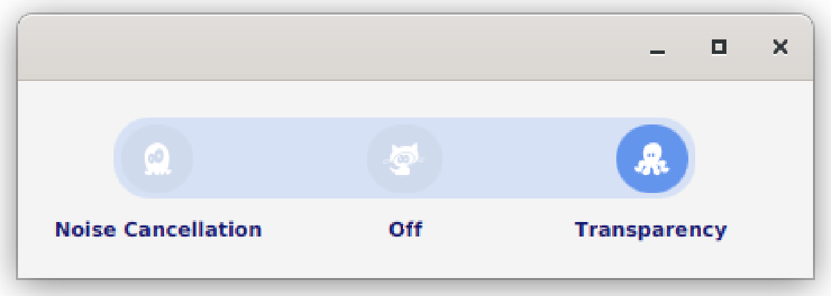
Which I think looks a lot like the original, at least in spirit.
Note: This article is still a “work in progress”, but I’m pushing it out live as soon as possible so that it might help the user that posted the original question on StackOverflow.com. I expect to change some of the code, and flush out the discussion about the approach in the next few days. That said, the code does work as it is and should be a reasonable starting place to build your own version.
The Design#
It was pretty simple to build the layout. It’s just VBox with two HBoxes inside of it. The top HBox has a set of ToggleButtons and it’s styled to look like the track that a flip switch would travel along. The ToggleButtons are round, and they have a unique icon in each one.
The second HBox has the Labels that go along with the ToggleButtons. They need to all be spaced out evenly to make everything look right.
I decided to implement this as custom class, extending Pane. Pane was as high up as I could go, since it’s the first one that supports getChildren(), meaning that I could put things in it.
My goal was to create something that was generically useful. By this, I mean a stand-alone Node that could be deployed just like any other JavaFX Node, and would behave substantially like all those other Nodes. This meant that I would need to provide properties and methods that would allow the layout code to configure it as required, and they would need to be accessed in the same way as the other Nodes.
There’s a Value property, and it’s defined as a JavaFX Bean. This means that there’s a valueProperty() method, a setValue() method and a getValue() method. The latter two are delegates to the Value property’s getValue() and setValue().
I also created an Enum for this called ToggleSelection. It only has three values: LEFT, CENTRE and RIGHT. The layout code is going to need to translate this into something that relates to its Model.
I wanted to keep the constructor simple, so it just takes the Strings for the three labels. To change the icons, there are three StringProperties deployed as Beans: LeftIcon, CentreIcon and RightIcon.
The Code#
class ToggleSwitch(private val label1: String, private val label2: String, private val label3: String) : Pane() {
   private val _value: ObjectProperty<ToggleSelection> = SimpleObjectProperty(ToggleSelection.CENTRE)
   var value: ToggleSelection
      get() = _value.get()
      set(newValue) = _value.set(newValue)
   private val standardWidthProperty: DoubleProperty = SimpleDoubleProperty(0.0)
   private val theToggles = ToggleGroup()
   private val _leftIcon: StringProperty = SimpleStringProperty("captainicon-146")
   var leftIcon: String
      get() = _leftIcon.get()
      set(value) = _leftIcon.set(value)
   private val _centreIcon: StringProperty = SimpleStringProperty("captainicon-150")
   var centreIcon: String
      get() = _centreIcon.get()
      set(value) = _centreIcon.set(value)
   private val _rightIcon: StringProperty = SimpleStringProperty("captainicon-158")
   var rightIcon: String
      get() = _rightIcon.get()
      set(value) = _rightIcon.set(value)
   private val leftButton = createButton(_leftIcon)
   private val centreButton = createButton(_centreIcon)
   private val rightButton = createButton(_rightIcon)

   fun leftIconProperty() = _leftIcon
   fun centreIconProperty() = _centreIcon
   fun rightIconProperty() = _rightIcon
   fun valueProperty() = _value

   init {
      children += createContent()
      minWidth = 400.0
      _value.bind(Bindings.createObjectBinding(this::checkValue, theToggles.selectedToggleProperty()))
      centreButton.isSelected = true
   }

   private fun checkValue(): ToggleSelection {
      return when (theToggles.selectedToggle) {
         leftButton -> ToggleSelection.LEFT
         centreButton -> ToggleSelection.CENTRE
         rightButton -> ToggleSelection.RIGHT
         else -> ToggleSelection.CENTRE
      }
   }

   private fun createContent(): Region = VBox(10.0).apply {
      children += buttonBox()
      children += labelBox()
      isFillWidth = false
      alignment = Pos.CENTER
   }

   private fun labelBox(): Region = HBox(20.0).apply {
      val labels = listOf(toggleLabel(label1), toggleLabel(label2), toggleLabel(label3))
      children += labels
      standardWidthProperty.bind(Bindings.createDoubleBinding({ labels.maxOfOrNull { label -> label.width } },
                                                              *(labels
                                                                 .map { label -> label.widthProperty() }
                                                                 .toTypedArray())))
      labels.forEach { label -> label.minWidthProperty().bind(standardWidthProperty) }
      alignment = Pos.CENTER
   }

   private fun toggleLabel(labelText: String): Region = Label(labelText).apply {
      styleClass += "toggle-label"
      alignment = Pos.CENTER
   }

   private fun buttonBox(): Region = HBox(20.0).apply {
      children += listOf(leftButton, centreButton, rightButton)
      spacingProperty().bind(standardWidthProperty.subtract(20.0))
      styleClass += "button-box"
   }

   private fun createButton(iconName: StringProperty) = ToggleButton().apply {
      styleClass += "toggle-switch-button"
      theToggles.toggles += this
      graphicProperty().bind(Bindings.createObjectBinding({ createIcon(iconName.value) }, iconName))
   }

   private fun createIcon(iconName: String) = FontIcon(iconName).apply {
      iconSize = 18
      iconColor = Color.WHITE
   }
}

enum class ToggleSelection {
   LEFT, CENTRE, RIGHT
}
You can test it with this:
class ToggleSwitchDemo : Application() {

   private val nameProperty: StringProperty = SimpleStringProperty("Not Started")
   private var counter: Int = 0

   override fun start(primaryStage: Stage) {
      primaryStage.scene = Scene(createContent()).addWidgetStyles().apply {
         object {}::class.java.getResource("/css/toggleswitch.css")?.toString()?.let { stylesheets += it }
      }
      primaryStage.show()
   }

   private fun createContent(): Region = BorderPane().apply {
      center = ToggleSwitch("Noise Cancellation", "Off", "Transparency").apply {
         valueProperty().addListener { _, _, newValue -> println("New Value: $newValue") }
      }
   } padWith 20.0
}

fun main() = Application.launch(ToggleSwitchDemo::class.java)
And…you’ll need this Style Sheet:
.root {
   -toggle-background: rgba(215,225,245,1);
}

.toggle-switch-button {
    -fx-min-width:  40.0;
    -fx-min-height: 37.0;
    -fx-background-radius: 40.0;
    -fx-background-color: derive(-toggle-background, -3%);
}

.toggle-switch-button:selected {
  -fx-background-color: cornflowerblue;
}

.toggle-label {
  -fx-text-fill: midnightblue;
  -fx-font-weight: bold;
  -fx-font-size: 11px;
}

.button-box {
   -fx-background-radius: 20;
   -fx-background-color: -toggle-background;
   -fx-padding: 4px;
}
Notes on the Code#
First of all, this is Kotlin. If you’re confused by the Kotlin, then you can take a look at this article and this article for some help.
The first part of the code is setting up the Java Beans. I’m using a technique that was described in this article. The net result is that you get the three public functions that you need for a Bean.
The init{} section is kind of like a constructor, and it calls the layout function and connects the Value property to the ToggleGroup.
createContent() gets the layout started. It creates a VBox and the calls two builder methods to create the HBoxes with the Buttons and Labels.
The only tricky part of the layout is getting the Labels spread out evenly in a generic manner, and keeping the ToggleButtons right on top of them.
To keep the Labels spread out, they need to all set to the same width, and that width needs to be enough to hold the biggest label. The obvious approach is the stream through the labels, and grab the biggest width, then set the MinWidth property of all three labels to that value.
However…
When the layout is built, nothing’s actually in the GUI, so any calls to look at the size of the Label.getWidth() will just return “0.0”. So that’s not gonna work.
However…
The Width of the Labels is a Property. This means that we can set a Binding on it. Yeah! And this is what we do here…create a Binding that’s dependent on the widthProperty() of all three labels, and that binding then streams through the Labels to grab the biggest width.
We’re also going to need that biggest width to space out our ToggleButtons. The best way to implement this is to create a private DoubleProperty field in the class, then directly bind that Property to our biggest width Binding. Then we can bind the minWidth() of each Label to this DoubleProperty.
For the ToggleButtons, we need to use this biggest width DoubleProperty to provide the spacing between the Buttons. This is easy, because we have HBox.spacingProperty(), and we can bind that to our biggest width Property with a slight adjustment for the actual width of the Buttons.
Ikonli#
This code uses FontAwesome through the Ikonli library. You’ll need to add the dependencies to your project to use it:
implementation('org.kordamp.ikonli:ikonli-javafx:12.2.0')
implementation 'org.kordamp.ikonli:ikonli-captainicon-pack:12.3.1'
The first dependency is the actual Ikonli library, and the second is the icon pack that I used.
This is using a slightly older version of the Ikonli library, and it looks like the newer versions handle